Category: Band Logos
August 22nd, 2019

When you think Led Zeppelin the first thing that's come to mind are the incredible albums released over the 12 years span they revolutionized rock. The second thing might be the iconic Icarus Swan Song logo that is so closely associated with Jimmy Page and company. It's the perfect image for a band like Led Zeppelin, a timeless piece of art that just feels right in the lore of classic rock.

We looked into the history of the Swan Song logo and picked out five interesting facts about the history of one of the most iconic logos in music history.

The Original Artwork Is In A Museum

The Led Zeppelin Swan Song logo is actually based off a sketch by William Rimmer, titled Evening (The Fall of Day), originally drawn in 1869. You can find the original piece at the Museum of Fine Arts in Boston, Massachusetts. 

The Pink Floyd and Motorhead Connection

The man who drew the incredible Swan Song logo is none other than Joe Petagno, a renown artist who also worked with Pink Floyd, Motorhead and plenty of other rock bands. Petagno is known especially for creating Motorhead album art and designs, like their own iconic mascot Snaggletooth.

The Swan Song Design Was Created For Their Record Label

While the Swan Song logo is tied so closely to the band, it was actually created as the “mascot” for their record label, Swan Song Records. The label lasted nine years (’74-83) before shutting down, publishing just under 30 studio albums while active. The next biggest act to Led Zeppelin was probably Bad Company, another legendary band.

“Icarus” Never Appeared On A Led Zeppelin Album Cover

Since the design was actually created for Swan Song Records, Led Zeppelin never actually featured the Icarus imagery on an album cover. Icarus is on plenty of tour tees and amazing Led Zep merch, it never graced their album artwork.

What Is Icarus, Anyway?

You know that saying about not flying too close to the sun? That’s from Greek mythology, from the story of Icarus. Young Icarus flew too high while escaping Crete, causing his wings to melt and plucking him out of the sky. It's the story of the rise and fall of a shooting star, though Led Zeppelin's lasting legacy will keep them in the air forever.


March 29th, 2019

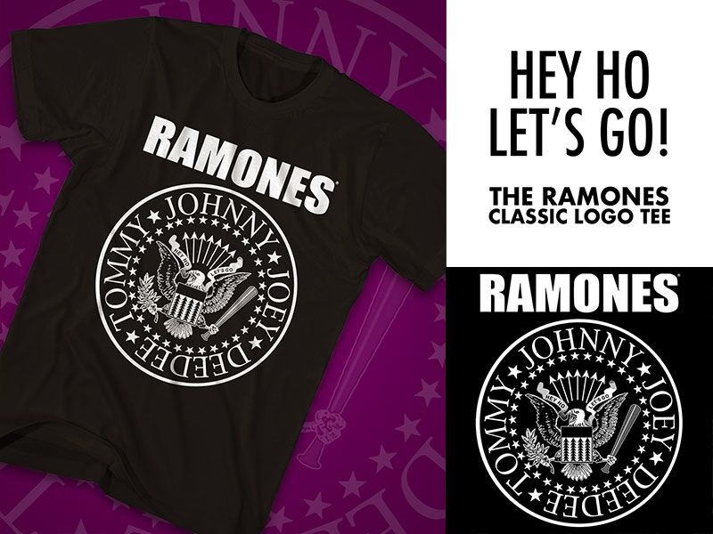
The Ramones are one of the most influential bands of all-time, birthing an entire genre of music as the fathers of punk. 40-plus years since their 1976 debut, the Ramones remain musical icons, and their logo is one of the most recognizable band logos ever created. Here are 10 awesome facts about the history of the Ramones' seal.

1. The man who designed their logo was the “fifth” Ramone

Arturo Vega, the man who designed the iconic Ramones logo, was widely considered the “fifth” Ramone. He was the band's creative director, archivist, and was responsible for creating the seal and t-shirt that propelled the Ramones’ image in their early years. Vega was also a close confidant of the group, even letting Joey and Dee Dee live with him before the band had recorded their first album.

2. The Ramones have sold more shirts than albums

The legendary Ramones classic logo t-shirt was actually the band’s primary source of income for several years, and overall, they've sold more shirts than albums. The Ramones seal continues on as a piece of living history, transcending music culture and becoming iconic around the world.

3. The “ultimate” all-American band

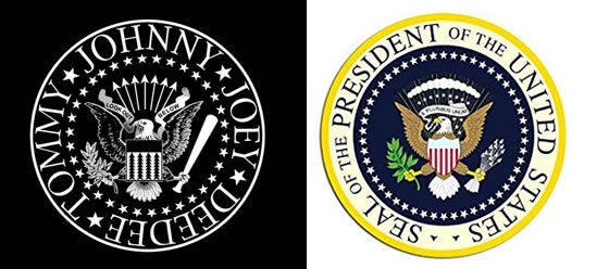
Vega saw the group as the “ultimate” all-American band, so he decided to use the US presidential seal as the foundation for the Ramones’ official logo. This design has stood the test of time, first created in 1976 and still going strong over four decades later. 

4. “Beat on the Brat” with a baseball bat

The eagle holds a baseball bat in one of its talons. This was meant to symbolize Johnny Ramones’ love for baseball, replacing the arrows traditionally held by the eagle. It was also a play off of the track Beat On The Brat. 

5. As American as apple pie

The eagle’s other talon, which holds an olive branch as a peace offering in the presidential seal , is actually holding an apple tree branch. This ties back to Vega’s belief that the Ramones were “as American as apple pie.”

6. “Hey Ho, Let’s Go!”

The banner held in the eagle’s beak reads “Hey Ho, Let’s Go,” which are the famous lyrics from the band’s first single “Blitzkrieg Bop.” Vega initially had the idea of using the text “Look out below” instead, but decided to go with the now-iconic lyrics. 

7. Capturing the Ramones’ sound

The Ramones’ logo is filled with imagery, and while Vega did remove the arrows from the eagle’s talons, he still included them as a way to represent the band’s “aggressive” sound. Instead of the star design above the eagle’s head, arrows are striking outward. 

8. Replacing the red, white and blue shield

The red, white and blue shield at the center of the presidential seal was also replaced by Vega. The use of arrowheads was another way to symbolize the edgy punk sound the Ramones created. 

9. The founding members

While Vega may have been the “fifth” Ramone, the final detail of the seal was the inclusion of the four founding members names. Dee Dee, Tommy, Johnny and Joey — the original Ramones — each had their names included around the seal. The logo would update these names as lineup changes occurred over the years, but the original founding members’ names are the finishing touch on the world-famous logo.

10. The logo’s debut

The Ramones’ seal logo was a part of the band from the very start. The seal appeared on the back of the Ramones’ self-titled debut album and has been a part of the band’s identity ever since. 

March 13th, 2019

The Red Hot Chili Peppers are one of the greatest bands of all-time, evolving their sound and the entire rock genre since their self-title debut album released in 1984. Frontman Anthony Kiedis and legendary bassist Flea have been members of the lineup for all 30-plus years of the Red Hot Chili Peppers’ existence, founding the group while classmates in High School. Little did they know they’d be setting the foundation for one of the most influential groups ever.

The Red Hot Chili Peppers official logo was actually drawn by Kiedis in 1984. Label management asked the group to produce a logo, and Kiedis sketched the eight-pronged asterisk that fans associate with around the globe today. Kiedis didn’t have any specific reasoning or meaning behind the asterisk at the time, but it’s since gone on to be one of the most iconic band logos in music history. The bright red asterisk wound up being up the perfect logo for the Red Hot Chili Peppers, even if created on a whim. 

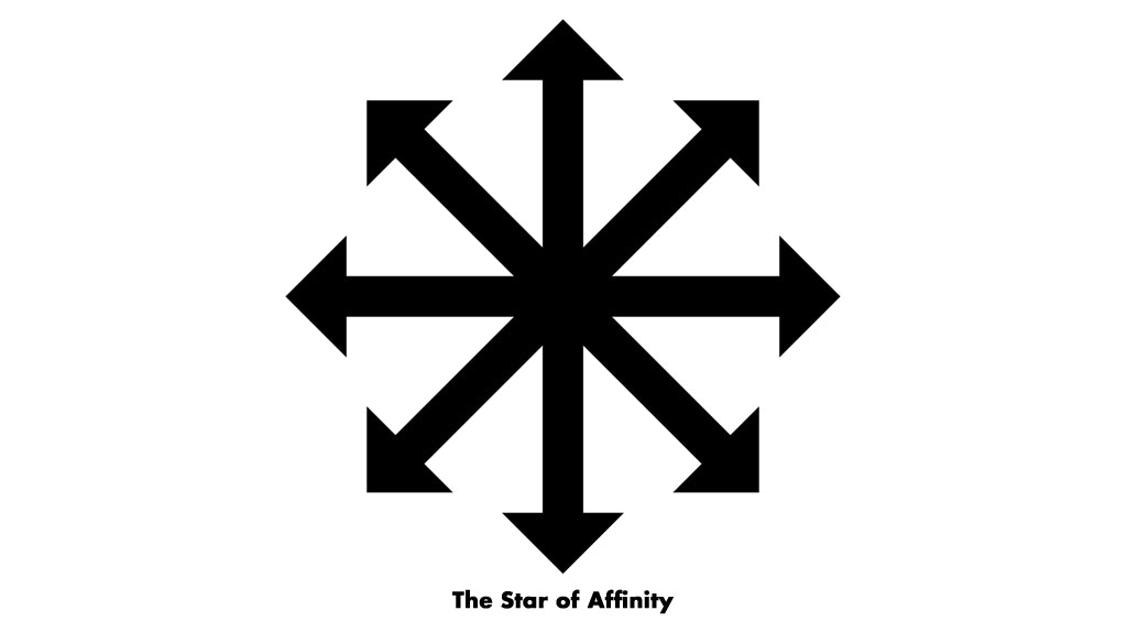
Fans have also connected the logo to the “Star of Affinity,” which was designed by author Michael Moorcock in 1970. The “Star of Affinity” created by Moorcock was his own representation of chaos, beginning his sketch by drawing the four cardinal directions (North, South, East West), then adding the additional four arrows to represent the additional “possibilities” representing the chaos in choice and life.  

Legendary author Kurt Vonnegut’s drawing of a similar asterisk in the preface of his 1973 novel Breakfast of Champions has also been associated with the Red Hot Chili Peppers’ logo. Vonnegut’s explanation of his drawing is a bit more… colorful… to say the least. Vonnegut’s asterisk was not an asterisk at all, according to him, but his “picture of an asshole” meant to give readers a forewarning about the “maturity” of his illustrations in the book. 

Vonnegut’s explanation is actually very close to what Kiedis explained about the logo in his 2004 autobiography Scar Tissue. Kiedis said that the the logo isn’t an asterisk at all, but that it’s “actually an angel in heaven’s asshole” viewed from below on Earth. 

No matter the meaning behind the logo, its significance to the band is unquestionable. Both Kiedis and former guitarist John Frusciante have the asterisk tattooed on their left wrists. Fans have done the same, getting their own tattoos of the logo, wearing merch with the asterisk, and designing their own unique versions the legendary Red Hot Chili Peppers’ calling card. 

Ultimately, the asterisk logo stands for one very important thing when fans see it: The Red Hot Chili Peppers. What was a quick sketch will forever be recognized as the sign of one of the greatest bands ever. From Fairfax High School to the history books, the Red Hot Chili Peppers carved their own path and brought their legion of admirers with them the whole way.

March 22nd, 2018

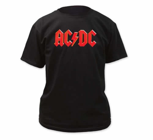
Heavy metal as we know it may not exist as it does today if it weren't for four letters, a lightning bolt and two brothers who carved their own path with guitars in hand. AC/DC is synonymous with rock ‘n’ roll.

Even if you can't name more than a handful of AC/DC tracks, their logo is recognizable anywhere to anyone. The iconic red bold letter font and lightning bolt logo wouldn’t come to fruition until their fourth studio album was released, though. 

Here are 15 facts about the legendary AC/DC logo! 

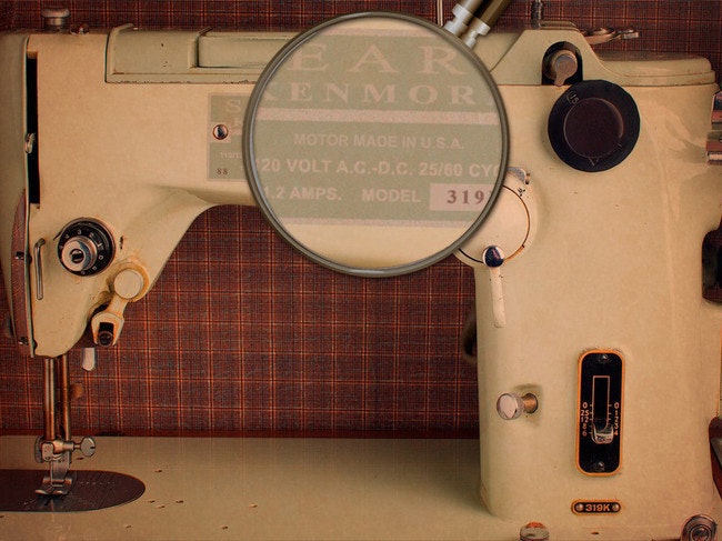
1. When the band was founded in 1973, brothers Angus and Malcolm Young drew inspiration for their name from seeing the initials AC/DC on their sister’s sewing machine.

2. Why AC/DC? The Young brothers felt it captured the energy of the music they wanted to create.

3. Their first album High Voltage (1975) was an Australia exclusive and featured Angus Young in his classic school uniform outfit front and center of the cover artwork. What it didn’t feature was the logo they’re known for.

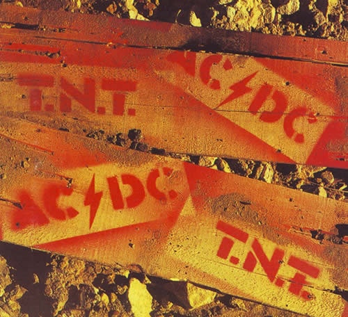
4. The band went with a spray paint stencil look for TNT, their second album,  but were still honing in on the idea of the high voltage sign splitting the lettering.

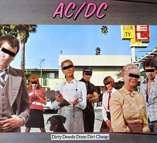
5. AC/DC’s third studio album, Dirty Deeds Done Dirt Cheap (1976), took a different approach with the logo. Gone was the lightning and raw look of the previous albums, looking something more like it came straight out of the Miami Vice collection.

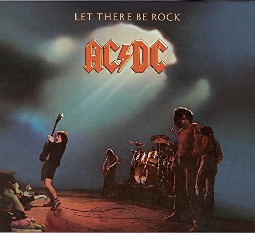
6. It wasn’t until their fourth studio album, Let There Be Rock, that the iconic AC/DC logo made its appearance. 

7. 25-year-old Gerard Huerta created the now-iconic design in April of 1977. He also designed the logo for High Voltage.

8. The record label paid Huerta for a one-time commission for the band’s logo, never indicating that it would be used on a permanent basis. 

9. Huerta has never received royalties for the logo despite it being one of the most recognizable in music, and never hired a lawyer or complained. The band or record label also never contacted him about it, either. 

10. The font design was inspired by the Gutenburg Bible, the first mass-produced movable metal type book in history.

11. The album’s title track “Let There Be Rock” was a biblical storytelling of how rock ‘n’ roll was born, inspiring Huerta’s design. 

12. AC/DC went away from the logo for their next album Powerage. This would be the last cover artwork on a studio album that didn’t feature their famous logo. 

13. The logo has appeared on 12 covers total, featured on 11 straight albums for AC/DC. The coloring and outline has been modified for aesthetics, but the basis of the design is still Huerta’s Gutenburg Bible font.

14. AC/DC merchandise is still a huge draw, and in 2016, the band filed a lawsuit to prevent bootleg products from being sold during their Rock or Bust tour

15. AC/DC is the 10th-most selling music act in history, selling 72 million records throughout their illustrious career. That logo has been in the hands of many music lovers around the world over the 40-plus years they’ve been making music. 

You can check out all of AC/DC’s merchandise and vinyl records here.

October 13th, 2015

Without Metallica, there would be no modern metal — at least as we know it. From day one, Metallica was faster, louder, and heavier than anything else that had been heard at the time. Formed in 1981, the band has sold over 50 million Metallica albums since 1991, they have had five consecutive albums debut at number one on the Billboard 200, and they were the first band ever to play all seven continents.

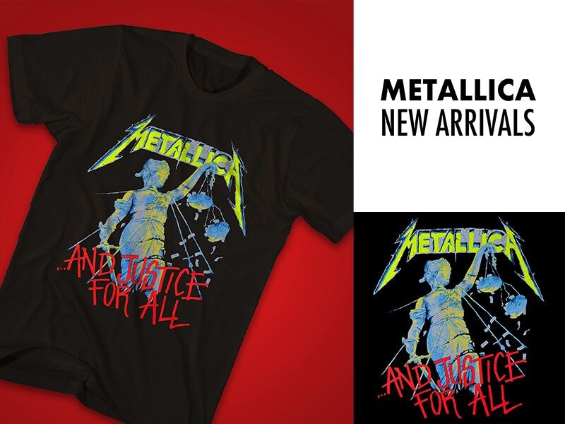
Unlike a lot of bands who may change their logo numerous times over the years, Metallica has kept the same signature logo their entire career, with only slight iterations. Originally designed by singer James Hetfield, and first seen on the cover of 1982’s “Power Metal,” Metallica’s first released demo, the logo that displays the band’s name is nearly as iconic as many of the group’s biggest hits. The rigid edges, the way the “M” and “A” hook around, almost as if they are framing the album’s cover art, and bold edges of the logo’s font all protrude the same amount of attitude as Kill Em All.

Except for St. Anger, which featured no text on its cover, all mainline album releases by Metallica have featured the band’s logo in one way or another. Often very large and very prominent, every single piece of Metallica merchandise sold on Merchbar.com also proudly displays the band’s logo. From the vintage Metallica Damage Inc. Tour ‘86 shirt to the fan-favorite Four Horsemen tee it is easily recognizable, and both the band and fans alike proudly display the logo across their chest, stage, and shelves.

Metallica’s logo saw a more conservative redesign for sister albums Load and Reload, with edges being softened and points being shortened. But other than that — and the aforementioned St. Anger— Metallica’s logo has stayed true to form, and for good reason.

Buy Master of Puppets on vinyl now!

In 2008, when visual artist Turner Duckworth was hired to design album art for the band’s latest release, Death Magnetic, he wanted to revive the original logo: modernizing it, yet holding true to the original. Because “great brands are unmistakable,” his website reads.

With rumors of a new Metallica album in the works, time will tell if the band once again employs their iconic logo, but chances are that after 34 years, the band is firm believers in “if it ain’t broke, don’t fix it.” Make sure to check out all of Merchbar’s Metallica merchandise here.

September 14th, 2015

Background

When people think of 90’s rock, they think of the grunge. Arena’s once glutted with hairspray, leather pants, and indulgency were suddenly turned on their heads head with flannel shirts draped over dirty jeans and Pearl Jam shirtsAlice In Chains tees and Soundgarden t shirts. This organic brand of American punk from Seattle gave rock n’ roll a shot in the arm that some retrospectively say was overdue.

At the forefront of this transition was Nirvana, the iconic band of Kurt Cobain, Krist Novoselic, and Dave Grohl. These three created a legacy of music, culture and, what would have likely been surprising to their fans at the time, fashion.

The History of the Nirvana Logo

But the history behind the Nirvana logo still emblazoned on the front of millions of shirts is still unclear. In it’s official version it includes the band name “Nirvana” printed in yellow against a black background and above a yellow smiley face. The face has a tongue playfully sticking out and the letter “x” for each eye. In 1991, the logo made its debut on a poster that promoted the band’s release party for its commercial breakthrough album Nevermind. It has since been printed on Nirvana shirts and other Nirvana merchandise worn by fans worldwide.

Inspiration for the Nirvana Logo

Yet, the inspiration for the design is still a mystery, suggesting Cobain might have been the only person who knew its true origins. There have been several theories about this, but none have been confirmed. The one with the greatest possibility is that the logo was derived from the emblem of a former strip club in Seattle, Washington called The Lusty Lady. The club’s logo bore a strong resemblance to Nirvana’s “smiley face.” In addition, the band originated in Cobain’s hometown of Aberdeen, Washington, which is just over 100 miles from Seattle.

The Nirvana Logo Font

The font style for the band’s name is Onyx. This style was picked at random when Lisa Orth paid Grant Alden to use whatever font was programmed into his typesetter at that very moment. Orth is a former Art Director of Sub Pop Records, the label that released Bleach, Nirvana’s debut album, in 1989. The Onyx type has stuck ever since.

The Nirvana Logo’s Enduring Legacy

Like the band’s legacy, the popularity and mystery of its logo endures to this day. What’s amazing is that a group whose songs captured life’s complexities and contradictions had a surprisingly simple emblem. The sound that epitomized angst and foreboding was emblemized by a mere “smiley face.”

Merch featuring the Nirvana Logo

Official Nirvana Logo Smile T Shirt – $20 On sale, click for price!

Nirvana Logo Hoodie – On Sale, Just $39.99

Nirvana Logo Poster – Fabric

Or click here to see all of our official Nirvana merchandise in our Official Nirvana Store.