


Heavy metal as we know it may not exist as it does today if it weren't for four letters, a lightning bolt and two brothers who carved their own path with guitars in hand. AC/DC is synonymous with rock ‘n’ roll.
Even if you can't name more than a handful of AC/DC tracks, their logo is recognizable anywhere to anyone. The iconic red bold letter font and lightning bolt logo wouldn’t come to fruition until their fourth studio album was released, though.
Here are 15 facts about the legendary AC/DC logo!
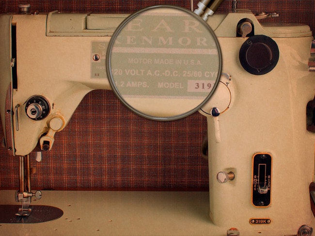
1. When the band was founded in 1973, brothers Angus and Malcolm Young drew inspiration for their name from seeing the initials AC/DC on their sister’s sewing machine.
2. Why AC/DC? The Young brothers felt it captured the energy of the music they wanted to create.
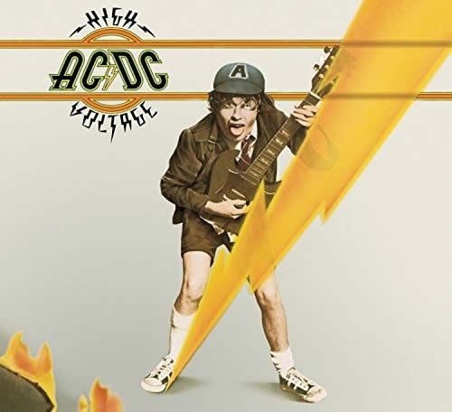
3. Their first album High Voltage (1975) was an Australia exclusive and featured Angus Young in his classic school uniform outfit front and center of the cover artwork. What it didn’t feature was the logo they’re known for.
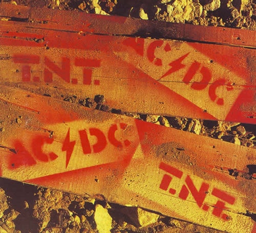
4. The band went with a spray paint stencil look for TNT, their second album, but were still honing in on the idea of the high voltage sign splitting the lettering.
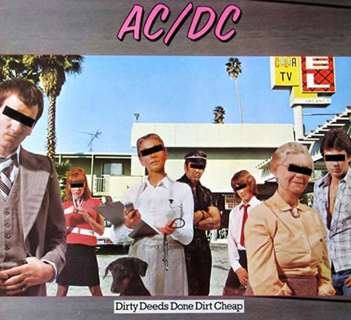
5. AC/DC’s third studio album, Dirty Deeds Done Dirt Cheap (1976), took a different approach with the logo. Gone was the lightning and raw look of the previous albums, looking something more like it came straight out of the Miami Vice collection.
6. It wasn’t until their fourth studio album, Let There Be Rock, that the iconic AC/DC logo made its appearance.
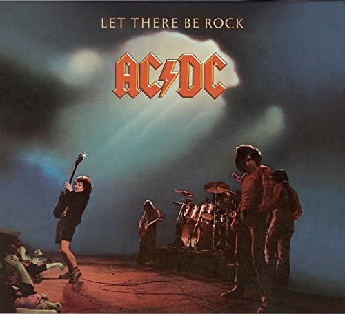
7. 25-year-old Gerard Huerta created the now-iconic design in April of 1977. He also designed the logo for High Voltage.
8. The record label paid Huerta for a one-time commission for the band’s logo, never indicating that it would be used on a permanent basis.
9. Huerta has never received royalties for the logo despite it being one of the most recognizable in music, and never hired a lawyer or complained. The band or record label also never contacted him about it, either.
10. The font design was inspired by the Gutenburg Bible, the first mass-produced movable metal type book in history.
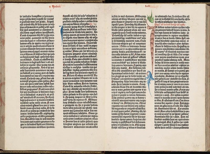
11. The album’s title track “Let There Be Rock” was a biblical storytelling of how rock ‘n’ roll was born, inspiring Huerta’s design.
12. AC/DC went away from the logo for their next album Powerage. This would be the last cover artwork on a studio album that didn’t feature their famous logo.

13. The logo has appeared on 12 covers total, featured on 11 straight albums for AC/DC. The coloring and outline has been modified for aesthetics, but the basis of the design is still Huerta’s Gutenburg Bible font.
14. AC/DC merchandise is still a huge draw, and in 2016, the band filed a lawsuit to prevent bootleg products from being sold during their Rock or Bust tour.
15. AC/DC is the 10th-most selling music act in history, selling 72 million records throughout their illustrious career. That logo has been in the hands of many music lovers around the world over the 40-plus years they’ve been making music.
You can check out all of AC/DC’s merchandise and vinyl records here.